
4 min read
Answer with a picture: replying to support questions with a visual
When a customer asks how to do something, a screenshot or a short video often beats five paragraphs of instructions. Here is when a visual answer works best, and when text is still the better reply.
By The Primordio team
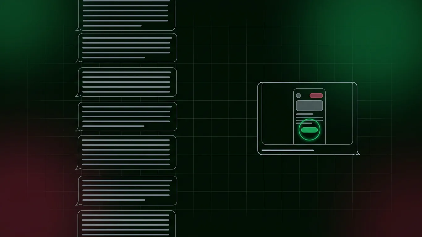
A customer writes in: “How do I add a teammate to my project?” The support agent knows the answer by heart. They type it out: open the project, go to the settings tab, find the members section, click the invite button, enter the email address, choose a role, send.
Seven steps, written clearly. The customer replies twenty minutes later: “I don’t see a members section.”
The instructions were correct. The problem is that the customer was looking at a different screen, or the tab was labeled differently than they expected, or they scrolled past the section. Text describes an interface. A picture shows it.
Why visual answers land
They remove the translation step. Written instructions ask the reader to turn words into a location on a screen. “The gear icon in the top right” is easy to write and surprisingly easy to misread. A screenshot with the icon circled leaves nothing to interpret.
They confirm the reader is in the right place. A visual shows the customer what they should be looking at. If their screen doesn’t match, they know straight away, and so does the agent when they reply.
They show the order of things. A short video makes the sequence obvious: this menu opens, then this dialog appears, then this button becomes active. That order is easy to get wrong from a list.
They cut the back-and-forth. Every “I don’t see that” reply adds another round to the ticket and another wait for the customer. A visual answer is more likely to resolve the question on the first reply.
Matching the visual to the question
Not every question needs a video. Match the format to the size of the task.
One location: a screenshot
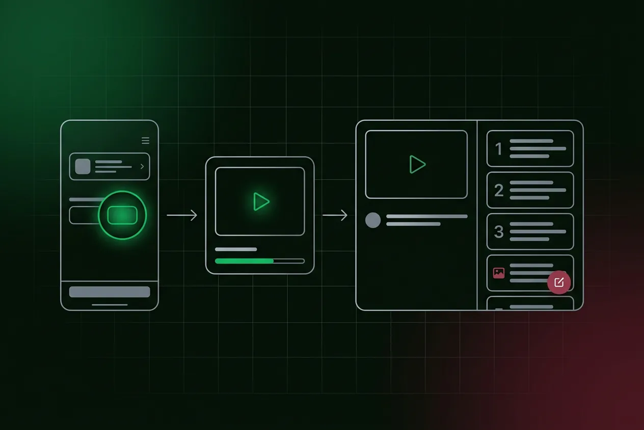
“Where do I find my invoices?” needs one picture of the right screen, with the relevant control highlighted. An annotated screenshot is the fastest visual to make and the fastest to read.
A few steps: a short clip or a numbered set of images
“How do I export a report?” might take four clicks. A short clip of 20 to 60 seconds, or a handful of numbered screenshots, shows the path without asking the customer to watch something long.
A full workflow: a tutorial
“How do I set up single sign-on?” is a process, not a question. Link to a complete tutorial that walks through it with narration, and pair it with a written guide the customer can follow at their own pace.
When text is still the better answer
Visuals are not always the right reply.
- Values to copy. API keys, configuration snippets, URLs and commands belong in text, where they can be copied without typos.
- Concepts and explanations. “Why was I charged twice?” is about understanding, not navigation. A clear paragraph beats a screenshot.
- Quick yes-or-no answers. “Can I change my username?” deserves a direct answer first. A visual can follow if the answer is yes.
- Situations a picture can’t capture. Errors that depend on the customer’s data or setup often need diagnosis before any visual will help.
The strongest replies often combine both: one or two sentences of direct answer, then the visual, then any values in text.
Making visual answers practical
The usual objection is time. An agent can type an answer in two minutes, while making a fresh screen recording for every ticket is not realistic. The answer is to stop making them per ticket.
Build a library of reusable visuals. Most “how do I” questions repeat. The tenth customer asking how to add a teammate should get the same high-quality visual as the first, pulled from a library rather than recorded on the spot. See every “how do I” ticket is a documentation bug for turning repeat questions into that library.
Keep visuals free of real data. Never screenshot a customer’s account to answer another customer. Use a demo account with fictional data, so any visual can be reused safely.
Keep them current. A screenshot of last year’s interface is worse than no screenshot, because it confirms the customer’s suspicion that they’re in the wrong place. Every visual in the library needs an owner and a way to be refreshed when the product changes.
Make them easy to find mid-ticket. If an agent has to search for five minutes, they will type the answer instead. Clear names and a consistent structure matter as much as the visuals themselves.
Where Primordio fits
Primordio turns a workflow described in plain English into a narrated video and a written guide with a screenshot for every step. That makes it practical to build the reusable library behind visual answers, and to refresh it when the interface changes instead of re-recording each clip by hand.
A quick checklist
- Replies to “how do I” questions lead with a direct answer, then a visual.
- Single locations get an annotated screenshot; short tasks get a short clip.
- Full workflows link to a complete tutorial with a written version.
- Values to copy are always in text.
- Visuals come from a shared library, not from customer accounts.
- Each visual has an owner and is refreshed when the interface changes.
Customers rarely write in because they can’t read. They write in because they can’t find what the words describe. Showing them is often the quickest way to close the gap.